Type: Indivdual Project
Duration: 1 week sprint
Tools: Framer, Illustrator
My Role: Product Designer, Usability Tester
Brief
How might we enable users to smoothly and quickly book visits to the recycling centre?
Overview
Fife Council is the local authority for Fife, a large town located in Scotland. When I have to book a reclycling slot, I have to use their booking system. Everytime I use the system, I get frustrated, so this is why I decided to redesign the booking process. My aim is to try and reduce the pain points at certain touch points and also improve the user experience.
Process
Problem
Users get confused when trying to book a slot at their local recycling centre. This turns quite a simple task into a frustrating one. This will affect people completing the booking process, which in turns puts a strain on local services
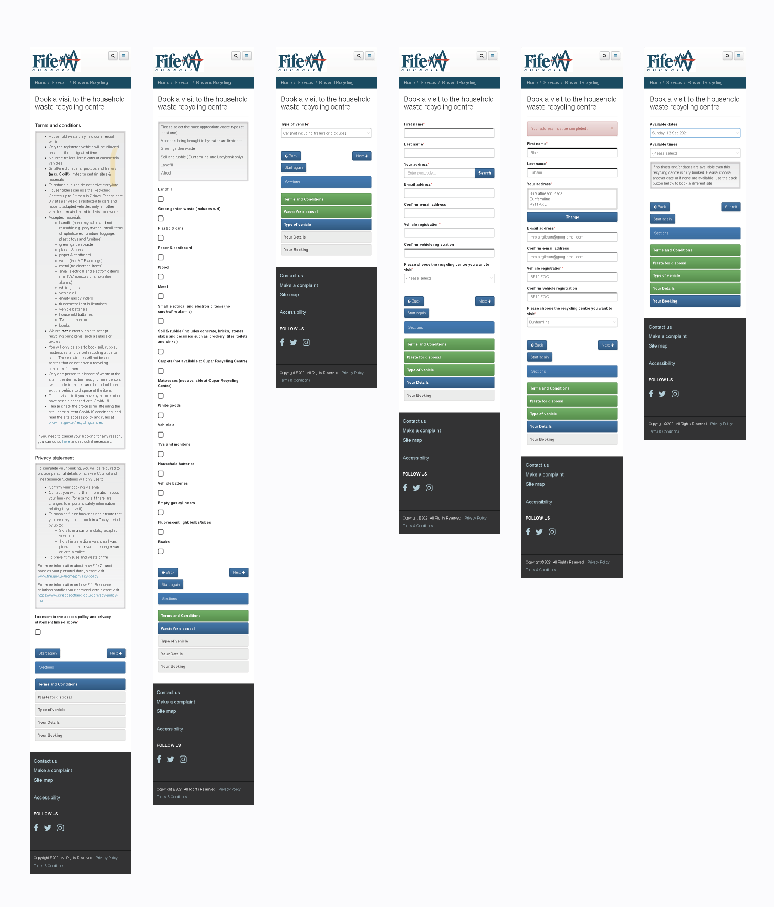
Current flow

To start with, I decided to observe 2 users use the app, to try and understand more where the pain points were when trying to book a slot.
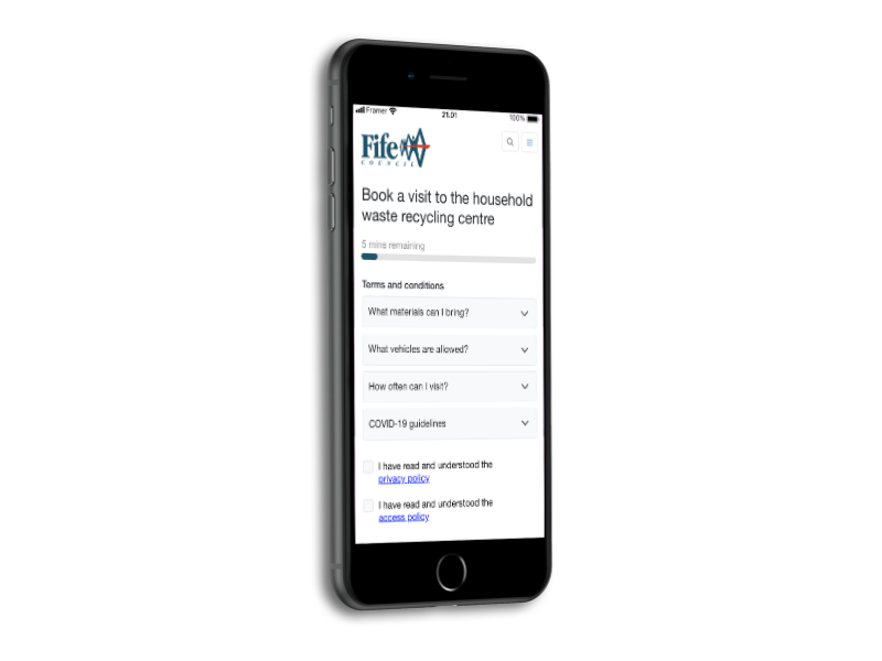
User flow

JOURNEY MAP

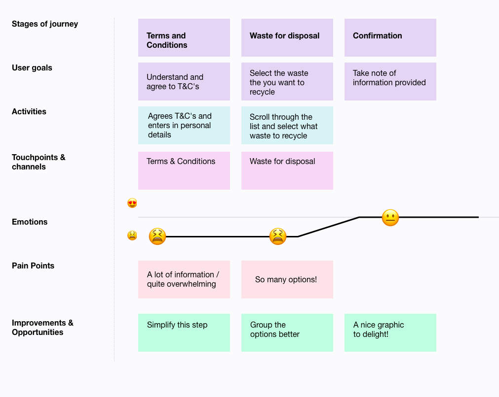
Current Design Problems


Collected Insights
A lot of text and all of it displayed at once is quite overwhelming
A lot of choices when trying to make a decision
No real sense of where you are in the process
Design & Iteration
When reading through some of the feedback, these were the areas which I decided to focus on and improve.
-
A more visual way to make sure the user knows where they are during the booking process
-
Try to reduce the overwhelming nature of all the text which is visible on the screen
-
Make it a more enjoyable experience from start to finish
Initial Wireframes
")
breakdown of flow

final screens (Video)
In conclusion
I really enjoyed this quick 2 day sprint. Testing the inital flow with family members and then going away and trying to figure out where the exisiting pain points were. Then being able to sketch up some ideas based on the insights I found.